


Figtree Physio is a team highly skilled physiotherapists treating their loyal clientele with the most specialised and up to date care available. I first worked with this local Wollongong based business around ten years ago and they recently approached me to refresh their brand and modernise their website.
In a marketplace cluttered with logos using stylised human figures, I created an ownable symbol that combines the letter f with a simplified shape of a figtree. As well as acting as a visual link to their name and location, the tree shape also symbolises growth and wellbeing. Pairing this mark with modern typography, a bold colour palette and professional photography helps creates a memorable identity that is used throughout print and digital applications.
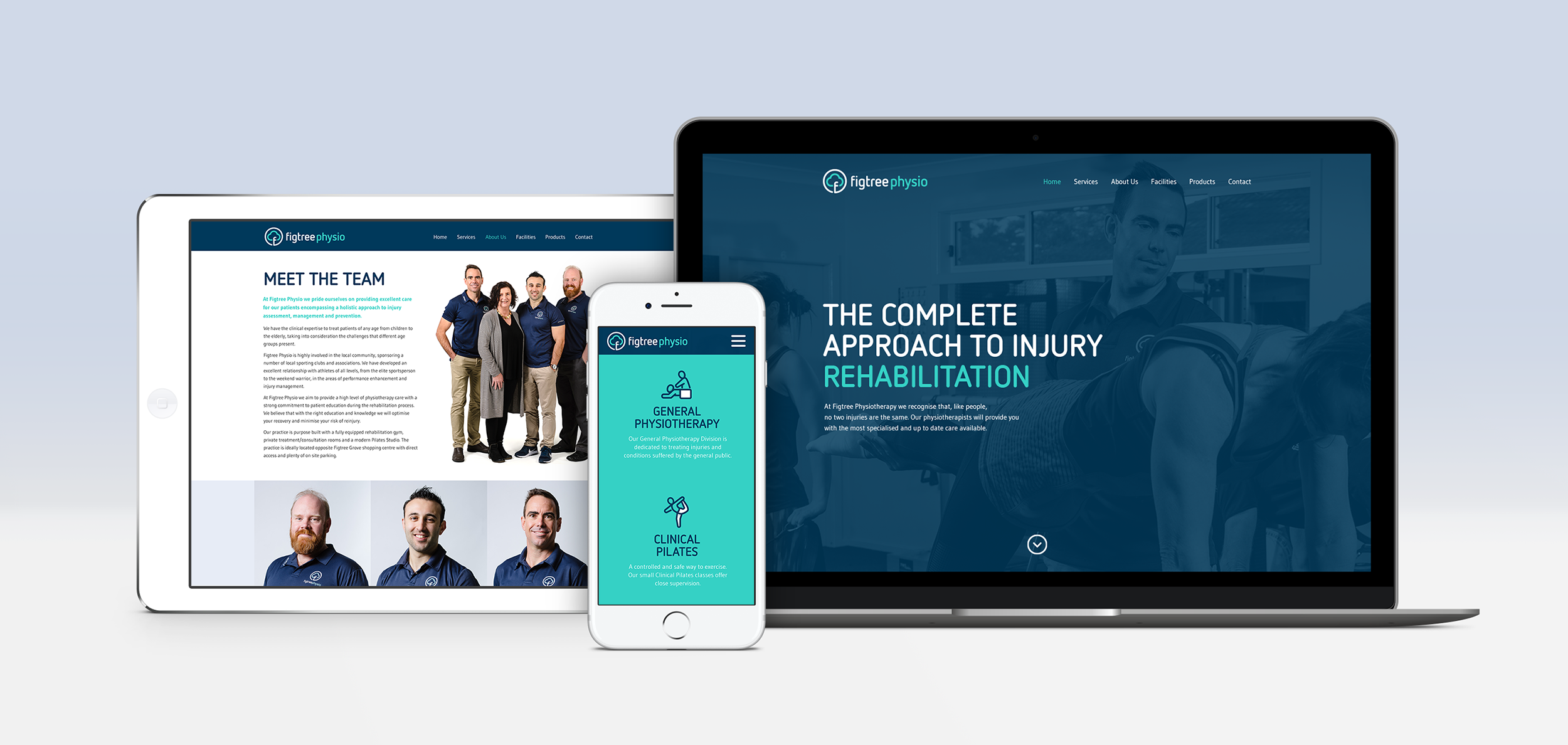
Utilising their new identity, I designed a custom built responsive website for Figtree Physio that’s beautiful as it is easy to use. I also created an icon suite to help communicate their services and provided art direction for the photography that was required for each section.